


If you’ve ever watched a film or YouTube video and noticed how the color and mood feel “just right,” that’s usually the result of color grading. In simple terms, color grading is the creative process of adjusting and styling the colors in your footage so it communicates a mood, supports a story, and looks consistent across shots. It sits on top of technical fixes (color correction) and turns correct footage into something with personality – warm, moody, cinematic, or bright and punchy depending on the story you want to tell.
In this guide you’ll get a clear explanation of what is color grading in video editing, a practical walkthrough you can use today, a comparison of tools, and the pro tips that usually live behind the scenes at professional studios (and Inside Editors). I’ll explain the difference between color correction and grading, the main tools and workflows, real mistakes to avoid, and when – and why – you might hire a pro. Let’s jump in.
What is color grading in video editing beyond

Color grading is more than filters. At its core, grading is the deliberate creative adjustment of color, contrast, saturation, and tone across your footage to support narrative or branding. Whereas color correction makes shots look “right” (matching exposure and white balance), color grading adds mood and atmosphere – the visual language that tells the viewer how to feel about a scene. This distinction is widely used across filmmaking and post-production.
Think of color correction as the technical groundwork – aligning shots so they’re consistent – and color grading as painting on top of that canvas. The colorist chooses what to highlight, what to mute, and how to guide the audience’s eye. In practical terms this may include lifting skin tones to be flattering, deepening shadows for drama, adding teal-and-orange contrasts for blockbuster energy, or making the palette desaturated for a documentary feel. These choices are subtle but powerful; they can change the perceived time of day, amplify emotion, or unify a multi-camera production.
Color grading vs color correction – a closer look
Color correction fixes problems: exposure shifts, incorrect white balance, and mismatched cameras. It’s the technical equalizer that makes footage neutral and comparable across shots. Color grading, by contrast, uses the correct footage as input and focuses on aesthetics: styles, tone mapping, and storytelling. Many professional workflows treat them as separate passes – correct first, then grade – which helps keep technical fixes separate from creative decisions and ensures consistency across sequences.
The basics: tools, concepts and what they do

Before you grade, it helps to understand the core tools and concepts you’ll use. The modern colorist works with a handful of standard controls – color wheels, curves, scopes, nodes (or layers), and LUTs (Look-Up Tables). Each tool has a specific purpose: wheels let you adjust shadows, midtones, and highlights; curves provide precise tonal control; scopes (waveform, vectorscope, histogram) show you what the image data actually looks like; nodes let you layer corrections and creative adjustments; and LUTs let you apply a predefined look quickly. These elements form the practical toolkit for shaping a shot.
Professional color grading applications like DaVinci Resolve have entire workspaces dedicated to these tools, including specialized log grading wheels designed for film-style grading that give tight control over shadows, midtones, and highlights. If you’re just learning, you’ll still find comparable controls in Premiere Pro, Final Cut Pro, and many consumer editors, but Resolve is considered the industry standard for complex grading due to its node-based workflow and advanced controls.
What a LUT does and when to use it
A LUT (Look-Up Table) is essentially a preset: it maps input color values to output color values to recreate a specific look across different clips or projects. Used correctly, LUTs save time and give consistency; used blindly, they can clip skin tones or crush detail. Many colorists use LUTs as a starting point – applying a technical LUT to convert a camera’s log footage to a neutral baseline, then layering a creative LUT or handcrafted adjustments to achieve the final look. Understanding what a LUT does (and doesn’t do) keeps your grades flexible and non-destructive.
A workflow you can use right now
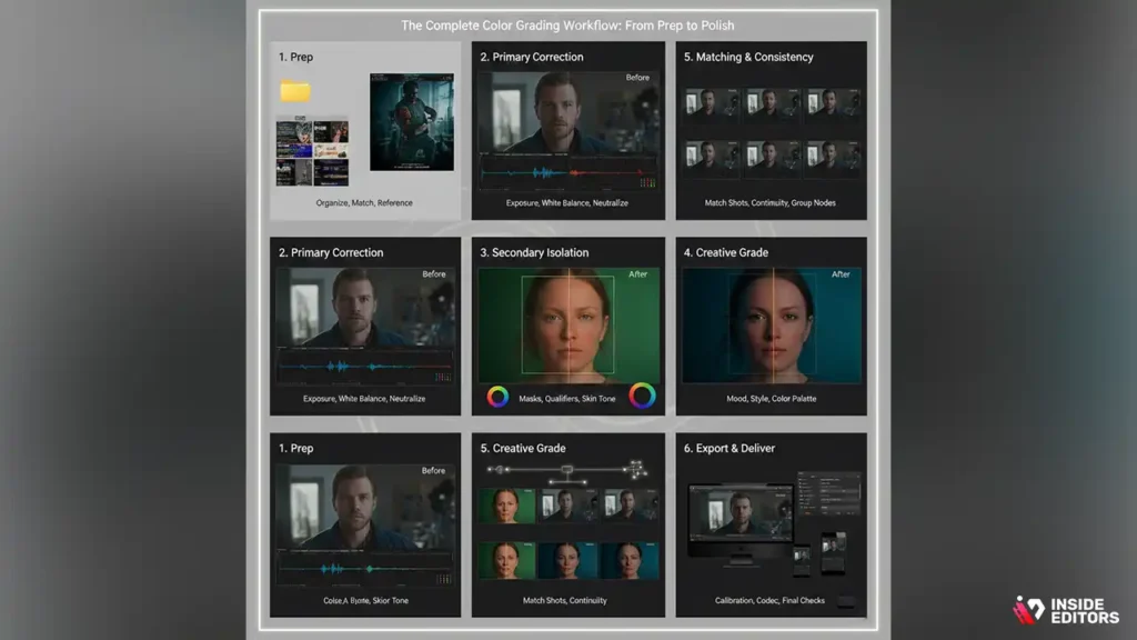
You don’t need to be an expert to make footage look noticeably better. Below is a practical workflow that mirrors professional practice but stays friendly for creators and freelancers. I’ll walk through the essential stages and what to do in each one – without overwhelm.
1. Prep: organize, match frame rates, and pick a reference
Start by organizing clips into meaningful bins by scene, camera, or lighting condition. Rename or tag the master files so you know where they came from. Choose a reference frame or two that represent the look you want – this could be a still or a clip from a film, or simply a frame you shot that looks perfect. Having a reference makes creative decisions faster and keeps clients aligned. This step prevents wasted time later when you’re trying to guess the intended style.
2. Primary color correction – technical baseline
Make basic technical fixes first: correct exposure, set black and white points, and fix white balance so shots within a scene feel consistent. Use scopes (waveform and vectorscope) to avoid relying on the monitor alone – our eyes deceive us under different lighting. Make these adjustments conservatively; the goal is neutral, stable footage that matches across cameras. This stage is where many editors stop and feel satisfied – but true cinematic polish comes next.
3. Secondary corrections and isolation
After your baseline, isolate problem areas or highlight subjects. Use masks, qualifiers, or windows to adjust skin tones independently from the background, or to correct unwanted color casts on specific objects. This targeted approach prevents global changes from harming important elements like faces or brand colors.
4. Creative grading – defining the mood
Now apply the creative grade. Consider contrast, color relationships (e.g., complementary colors), and how color will guide attention. If you want a cold drama, cool the shadows and slightly warm the highlights; for an upbeat vlog, boost saturation and lift midtones. Work slowly and repeatedly toggle before/after to ensure changes support the scene rather than distract.
5. Matching and consistency
Pull up multiple shots from the same scene and match them so they read as one event. Matching often uncovers small shifts you missed earlier – a slightly different white balance or exposure can break continuity. Create group or timeline nodes/layers so you can apply a single adjustment to all shots in the scene and fine-tune from there.
6. Export and delivery checks
Before rendering final files, check them on a calibrated monitor if possible and view on a phone or target device. Export using the platform’s recommended color space and codec. If you’re delivering for social platforms, ensure you’re exporting with the correct color profile (e.g., Rec.709 for standard web/video, HDR for platforms that support it). Small quality checks catch big mistakes here.
How to avoid amateur looking footage

Many editors unintentionally sabotage their work with a few recurring errors. The good news: these are easy to fix once you know what to watch for.
One common mistake is over-grading – applying extreme color shifts or heavy contrast so the footage looks unnatural. Overly stylized looks can hide technical issues on first view, but they usually draw criticism later when viewed on different displays. The fix: dial back intensity, use split-screen comparisons, and test grades on phones and monitors with different gamma and brightness settings.
Another frequent problem is skipping the correction pass and jumping straight into creative grading. Without a neutral baseline, consistent grades across a scene are almost impossible. Always correct first, then grade. Related to this, many editors apply LUTs as a finish rather than as a starting point; use LUTs to speed consistent styling, but always tweak them to avoid clipping and maintain skin tone fidelity.
Color-blind accessibility is rarely considered but important for brand videos and public content. Avoid relying solely on hue for critical information; instead use contrast, brightness, or patterns when you need to differentiate elements clearly. Tools and plugins exist to simulate color-blind vision – use them as part of your QA process to make content inclusive.
Software choices for your budget and goals
You don’t need to buy the most expensive software to get great results, but your choice affects workflow and final quality. Below is a compact comparison of the most common solutions editors choose.
If your priority is cinematic control and advanced grading features, DaVinci Resolve is the industry go-to. If you prefer an integrated editing-plus-color workflow and you already use Adobe tools, Premiere’s Lumetri is fast and effective for most projects. Consumer options like Filmora or built-in tools in editing apps are great for lightweight projects and social content where speed matters more than pixel-perfect grading.
When to DIY vs hire a colorist
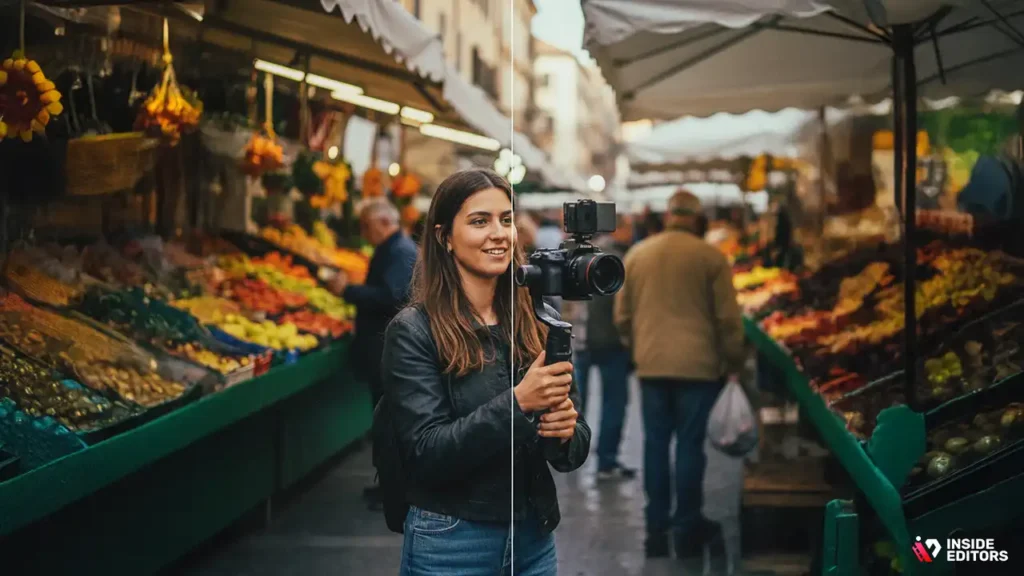
Many creators can achieve noticeable improvement by learning basic grading and following a solid workflow. If your project is a vlog, tutorial, or short social clip, a polished DIY grade is often enough. But consider hiring a professional colorist when stakes are higher: brand campaigns, weddings, feature films, or any project where consistency across many scenes matters and the emotional tone must be precise. Professionals bring calibrated studio monitors, industry-grade tools, and an experienced eye – they also know how to maintain skin tones, preserve dynamic range, and deliver broadcast-safe masters.
If you decide to hire help, pick a colorist whose portfolio matches the look you want and ask for a test grade on a sample clip first. At Inside Editors, our colorists combine technical rigor with creative sensibility to ensure your final videos look cinematic while remaining true to brand and storytelling goals. Explore Inside Editors’ Video Editing Services.
Tools behind professional color grading

Color grading might sound like a purely creative task, but the truth is that much of the magic comes from the tools editors use every day. The right software doesn’t just make grading easier – it also gives you full control over every frame. This is especially important if you’re learning what is color grading in video editing for the first time and want to understand how professionals work behind the scenes. Once you see how these tools function, it becomes much clearer why some videos look cinematic while others feel flat or inconsistent.
Why Choosing the Right Color Grading Software Matters
Different tools offer different levels of precision, and understanding these differences helps you choose the best option for your workflow. Professional colorists often prefer advanced platforms like DaVinci Resolve because it gives them deep access to color wheels, scopes, nodes, and complex grading pipelines. But not every project needs something that sophisticated. Many creators can achieve great results with easier tools such as Adobe Premiere Pro or Final Cut Pro, especially when they’re just beginning.
Think of it like photography – a skilled photographer can use a simple camera effectively, but having better tools allows for more control and more fine-tuned creative decisions. The same is true with color grading. By learning what each software specializes in, you can decide whether you need pro-level precision or user-friendly speed.
Comparing Popular Color Grading Tools and What They Do Best
Each tool has its strengths. DaVinci Resolve is renowned for its professional-grade color engine; Adobe Premiere Pro offers seamless integration with other Adobe tools; and Final Cut Pro is known for its smooth performance on Mac devices. If you’re working on social media content, you might even experiment with lightweight grading tools inside CapCut or mobile apps – but these usually offer more limited control.
Here’s a quick comparison to help you see how each software fits different editing needs:
| Software | Best For | Key Strength | Drawback |
| DaVinci Resolve | Professional colorists | Advanced node-based grading | Steeper learning curve |
| Adobe Premiere Pro | Editors who grade as they edit | Seamless workflow with editing & effects | Fewer advanced color features |
| Final Cut Pro | Mac-based creators | Fast performance, intuitive UI | Limited advanced grading controls |
| CapCut / Mobile Apps | Quick social content | Fast LUTs and filters | Not ideal for detailed correction |
Knowing this helps you choose a tool that matches your project and skill level – and prevents you from wasting hours trying to achieve results your software simply isn’t built for.
When Professional Editors Help You Go Further
Even with great tools, many creators eventually hit a limit – especially when working on videos that demand consistent color across multiple lighting setups or scenes. That’s where professional editors can make a huge difference. Services like Inside Editors use high-end tools and years of grading experience to give your videos the polished, cinematic look that’s difficult to achieve alone.
If you’ve ever felt frustrated that your videos don’t look “rich enough” or “balanced enough” no matter what settings you use, professional support can bridge that gap. And the best part is that you can still maintain your creative direction while letting experts handle the technical details.
Why color psychology matters in Grading

One of the most overlooked aspects of color grading is how deeply color affects emotion. Whether you’re creating a dramatic short film, a branded commercial, or a vlog, the color palette you choose shapes how viewers feel – often without them realizing why. This is why understanding the psychology behind color is essential, especially when learning what is color grading in video editing from a storyteller’s perspective.
How Color Shapes Mood and Storytelling
Color is more than an aesthetic choice; it’s a storytelling tool. Warm tones often feel inviting, emotional, or nostalgic, while cooler tones bring a sense of calm, mystery, or even tension. For example, wedding videos often lean toward warm highlights and soft pastels to create a romantic atmosphere. In contrast, tech product videos might use cool blues to reinforce modernity and clarity.
Color grading allows you to fine-tune these feelings. A simple shift from bright, vibrant colors to muted, desaturated tones can instantly change the viewer’s emotional response. This is why films often use consistent palettes – they reinforce the story’s tone scene after scene.
Using Color to Guide Viewer Attention
Beyond emotion, color grading also influences where viewers look. Our eyes naturally follow contrast, saturation, and brightness. By selectively adjusting these elements, editors can guide attention to the subject, emphasize important details, or downplay distractions in the background.
Imagine you’re shooting an interview video. If the lighting isn’t perfect, you can still use grading to brighten the speaker’s face while cooling down or darkening the background. This subtly directs attention without the viewer feeling manipulated. It’s one of the most effective ways to improve engagement in talking-head videos, testimonials, and YouTube educational content.
How Brands Use Color Consistency for Recognition
Brands rely on color to maintain identity. Think of Coca-Cola’s deep reds or Apple’s clean neutrals – these aren’t random choices. They are carefully built into every video campaign, product demo, and commercial. Consistent color builds trust and makes content more recognizable on social feeds.
This is especially important for businesses or creators looking to maintain a cohesive visual identity. Even if you film on different days, in different locations, or with different cameras, color grading ensures your videos still feel like part of the same brand family.
This is also why many companies partner with professional editors. Services like Inside Editors help maintain color consistency across entire content libraries, saving brands from the frustration of mismatched footage or unbalanced tones.
Top beginner color-grading mistakes

If you’re new to color grading, you’re not alone – everyone starts somewhere. But some mistakes can make a video look amateur, even if the footage itself is great. Knowing these pitfalls helps you avoid them and gives you a head start toward more polished results.
Over-Saturation That Makes Footage Look Unnatural
It’s easy to boost saturation because it makes colors instantly “pop.” But too much can quickly make skin tones look orange, greens look neon, and shadows look muddy. Human eyes are surprisingly sensitive to unnatural color shifts, and viewers instantly pick up on these mistakes even if they can’t describe what’s wrong.
The key is subtlety. Start with small adjustments and compare your footage with real-life references or professionally graded videos. If the colors start looking cartoonish, it’s a sign to dial back.
Inconsistent Color Across Different Scenes
One of the most common issues is footage that changes color from one scene to the next. Maybe you filmed indoors and outdoors on the same day, or maybe you used multiple cameras with different color science. Whatever the cause, inconsistency can make your video feel disjointed and unprofessional.
A good colorist first focuses on “matching shots” – ensuring that exposure, contrast, and white balance align across all footage. Only after achieving consistency do they start adding stylistic looks. This structured workflow is something many beginners skip, resulting in uneven results.
Skipping Proper Exposure Before Applying LUTs
LUTs are popular because they instantly create a stylized look. However, applying a LUT on badly exposed footage often produces harsh contrasts, clipped whites, or crushed blacks. LUTs are designed for properly balanced footage – not for rescuing mistakes.
A smarter workflow is to first correct your footage: adjust exposure, fix white balance, and refine contrast. Once the image is stable, a LUT will look significantly better and require fewer tweaks.
Relying Too Heavily on Presets
Presets are great for saving time, but no preset fits all footage perfectly. Lighting, camera sensors, and environments vary too much for a one-click solution. Many beginners lean on presets thinking they’ll “fix” everything, but in reality, presets are just a starting point.
Professional editors often build custom looks tailored to the project instead of relying solely on preset styles. This is one reason services like Inside Editors consistently produce better results – every project gets a unique color treatment based on the client’s goals and footage type.
Color grading for different video types

Every type of video benefits from color grading, but each uses color in a slightly different way. Whether you’re making cinematic films, social media content, or branded marketing videos, color grading helps elevate the visuals and create a unified aesthetic.
Cinematic Films and Short Stories
For narrative films, color grading is part of world-building. Every scene must feel like it belongs in the same universe, and color helps establish that universe’s mood. Dark thrillers might use blue shadows and desaturated palettes to evoke tension, while coming-of-age films often lean toward softer highlights and warm, nostalgic tones.
Cinematic grading is often more detailed and layered than other types of grading. Editors refine every highlight, midtone, and shadow to make the world feel cohesive and emotional.
YouTube, TikTok, and Social Media Content
Creators producing daily or weekly videos often prioritize speed, but color grading still plays a huge role. A well-graded video stands out instantly in fast-moving feeds. Influencers, beauty creators, and vloggers often use consistent color palettes to build their identity – rosy highlights for beauty content, rich greens for outdoor vlogging, clean neutrals for tech reviews.
Color grading also helps maintain consistency when creators record under mixed lighting or varied conditions. Even if you’re filming with the sun one day and LED lights the next, grading helps unify the final look.
Brand Videos, Ads, and Testimonials
Brands rely on polished visuals because it reflects their professionalism and credibility. Color grading ensures their products look appealing and their content aligns with brand identity. For example, beauty brands often prefer soft, flattering skin tones while outdoor brands may lean into natural, vibrant colors.
When businesses work with Inside Editors, they often request consistent color styles across multiple ads, product videos, or testimonials – creating a unified look across platforms like Instagram, TikTok, YouTube, and eCommerce listings.
Speciality Content Like Weddings and Travel Films
Weddings often use warm, romantic palettes that highlight the emotion of the day. Travel films might emphasize natural colors or stylize landscapes to look more dramatic. In both cases, grading adds the charm and atmosphere that viewers expect from emotional or visually driven content.
Step-by-step professional color grading workflow

Understanding the full color grading workflow is one of the best ways to elevate your own results. Even if you’re still learning what is color grading in video editing, walking through the actual steps used by professional editors helps you see the bigger picture. It turns color grading from something “mysterious” into a clear, repeatable process – and once you understand how the parts fit together, the entire craft becomes far less intimidating.
Preparing Your Footage for Grading
Before any color adjustments happen, a colorist organizes the footage and ensures every clip is ready for grading. This means converting media into editing-friendly formats, checking for dropped frames, and confirming color profiles. Many professionals also create folders or “bins” to group similar scenes. This small amount of preparation makes a huge difference in the flow of the project because it allows editors to focus on creativity instead of struggling with technical issues.
A common beginner mistake is diving straight into grading without setting up this foundation – and then wondering why the footage behaves unpredictably. Think of preparation as warming up before a workout. It helps you avoid problems you’ll regret later.
Primary Correction: Getting the Image to a Neutral Baseline
Once the footage is organized, the editor begins “primary correction.” This is where they fix the basics: exposure, contrast, white balance, and overall tonal balance. The goal isn’t to create a look yet – the goal is to create a clean, neutral foundation. This step is crucial because stylized grades only work well on footage that’s properly balanced.
If you’ve ever applied a LUT and felt like something looked “off,” it likely wasn’t the LUT’s fault. It was the lack of proper primary correction. Getting this stage right ensures that every clip matches the others before you move on to more artistic adjustments.
Secondary Correction: Fine-Tuning the Details
After primary correction, the editor moves into “secondary correction.” This stage focuses on adjusting specific parts of the image rather than the whole frame. For example, a colorist may brighten the subject’s face while keeping the background darker, or desaturate distracting colors while keeping the main palette intact.
Secondary correction is where precision tools shine. Masks, power windows, hue-vs-hue curves, and qualifiers all help isolate exact areas. This level of attention is what truly separates amateur work from professional-grade results.
Creating the Final Look
Only after the footage is technically correct do editors apply the creative “look.” This is where color palettes, mood, and stylization come into play. Some projects use soft pastel tones for emotional warmth, while others use cool highlights and deep contrast for a more modern aesthetic.
This stage often involves layering adjustments. A colorist may add subtle tints to shadows, adjust midtone contrast, refine skin tones, and enhance highlight roll-off. The goal isn’t extreme stylization – it’s harmony. A well-graded film feels balanced, cohesive, and emotionally aligned with the story.
Matching and Shot Consistency
Even after a look is applied, one final detail matters: consistency. A video shot on multiple cameras or in multiple lighting conditions must still feel unified. Editors compare frames side by side to ensure continuity across scenes. This step is especially important for weddings, documentaries, vlogs, and anything filmed over several hours or days.
Once everything is matched, the editor can export or hand off the files for final delivery – completing a workflow that blends technical skill with artistic vision.
How pro grading elevates story, style and quality

Color grading isn’t just about making footage attractive – it’s about elevating your entire production. Whether you’re creating personal content or building a brand, grading plays a major role in how viewers feel, how they perceive your quality, and how deeply they connect with your message.
Why Cinematic Color Grading Drives Emotional Impact
Great films stick with us not just because of their story, but because of how the visuals support that story. Warm tones often make scenes feel hopeful or nostalgic; cool tones evoke mystery or sadness; high contrast creates intensity; soft palettes add elegance.
A simple example is how horror films rarely use warm color throughout – it breaks tension. Instead, editors purposely push toward cooler, darker palettes. These choices aren’t random. They’re intentional, emotional signals crafted through color grading.
How Color Grading Shapes Brand Consistency
If you create content for business or personal branding, color grading becomes one of the most important tools for building identity. Consistent color styles help viewers instantly recognize your content, even when scrolling quickly. This is why brands invest heavily in controlled color palettes for ads, product videos, and testimonials.
A consistent color strategy communicates professionalism. It says, “This brand knows what it’s doing.” And that credibility directly impacts audience trust – something every creator or business needs.
Improving Viewer Engagement and Watch Time
Studies across YouTube and TikTok have shown that polished, well-graded videos hold attention longer. Viewers may not consciously think about color grading, but they feel it. Clean, vibrant, balanced visuals encourage viewers to watch more, engage more, and take your content more seriously.
This is especially powerful in talking-head videos, product demos, eCommerce showcases, and tutorials. A well-graded frame looks more inviting, helping the viewer stay connected to the message.
When professional color grading makes sense

As you deepen your understanding of what color grading does, you might notice that some results are difficult to achieve on your own. Maybe your lighting setup isn’t perfect, or your footage varies too much between scenes, or you simply want a more cinematic look than your software presets can provide.
For Creators Who Want Consistent Visual Style
Many creators reach a point where content quality matters as much as-or more than-content quantity. You want your videos to look cohesive, recognizable, and memorable. That’s often when creators partner with professionals to maintain a consistent color palette across all content, whether short-form or long-form.
For Brands That Need Polished Marketing Materials
Businesses producing promotional videos, product showcases, or ads often need visuals that communicate reliability and professionalism. Color grading plays a huge role in that perception. Brands trust professional editors because they can guarantee accuracy, consistency, and emotion-driven style decisions.
For Filmmakers Who Want Cinematic Quality
If you’re producing films, short stories, documentaries, or wedding content, professional color grading can elevate your footage from good to truly cinematic. It brings out emotional depth, reveals detail in highlights and shadows, and provides that polished finish viewers expect from high-quality productions.
How Inside Editors Can Support Your Color Grading Needs
At Inside Editors, we specialize in helping creators, brands, and filmmakers achieve polished visuals that support their story, identity, and goals. Whether you’re working on a wedding film, an influencer campaign, a talking-head series, or a cinematic short, our team ensures your footage gets the attention it deserves.
Our editors use industry-standard tools and proven grading workflows to bring out the best in your footage – all while respecting your unique style and vision. Instead of fighting with color sliders, you can focus on creativity, strategy, and storytelling while we handle the technical side.
You can explore how our services support every niche, from
- wedding video editing
- VFX and cinematic finishing
- talking-head content
- eCommerce videos
- beauty and aesthetic content and many more directly through our site.
If your goal is to create high-quality videos without spending hours wrestling with color balance, Inside Editors makes it easy, efficient, and affordable.
Final thoughts: Why color grading matters
Color grading isn’t just another step in the editing process – it’s one of the most powerful tools you have to shape emotion, identity, and viewer experience. Whether you’re building a brand, creating films, or simply wanting your videos to look more professional, understanding what is color grading in video editing gives you a clear advantage.
You’ve learned how color grading works, why it influences storytelling, and how different tools support different levels of creativity. You’ve also seen how professionals approach grading with detailed workflows and why consistency, emotion, and precision matter so much in the final product.
If you’re ready to bring your own videos to life – with richer color, stronger storytelling, and a polished professional look – Inside Editors is here to help. Our team handles everything from color correction to full cinematic finishing, tailored to your project and style.
Explore Inside Editors’ Video Editing Services
You’re now equipped with the knowledge to grade smarter, tell better stories, and create visuals that resonate. And if you ever need a professional finish, we’ve got your back.
FAQs
1. What is color grading in video editing?
Color grading is the creative process of shaping a video’s final look using contrast, saturation, shadows, and highlights. It helps match shots, guide viewer emotion, and build a consistent visual style. Think of it as the “mood polish” applied after basic color correction. Beginners can use built-in LUTs, while pros rely on tools like DaVinci Resolve for precision.
2. Do I need both color correction and color grading?
Yes-color correction fixes exposure and white balance so footage looks accurate, while color grading adds the stylized look. Skipping correction can make grading inconsistent across shots. Most editors follow a workflow: correct → balance → grade → final export. This ensures clean, cinematic results.
3. Is color grading worth it for YouTube or short-form content?
Usually yes, because even a light grade (e.g., boosting contrast and skin tones) can make videos more professional and clickable. Viewers subconsciously judge quality by color consistency. While full cinematic grading takes time, creators often apply LUTs for quick improvements. It’s a low-effort upgrade that helps branding stand out.
4. How much does professional color grading cost?
Professional grading typically ranges from $150 to $1,500+ depending on video length, revisions, and complexity. Basic packages include correction and a simple grade; advanced packages add skin-tone refinement, matching multiple cameras, and custom looks. Rush delivery or 4K+ footage may increase pricing. Always confirm ownership rights and revision terms upfront.
5. How long does color grading usually take?
Simple social videos can be graded in 2–6 hours, while high-end commercials or films may require several days. Turnaround depends on shot count, lighting inconsistencies, and whether correction is already done. Rush options are common but may cost extra. Clear references or style guides help speed up delivery.
6. Can I color grade videos myself without experience?
Yes, most beginners start with preset LUTs or auto-grading tools available in apps like Premiere Pro or DaVinci Resolve. DIY grading works well for simple vlogs or social videos, but may struggle with mixed lighting or multi-camera shoots. Pros deliver smoother skin tones, cleaner noise reduction, and accurate color balance. For brand-critical work, hiring a grader saves time and improves quality.
7. What tools are best for color grading beginners?
DaVinci Resolve (free version) is the industry standard with powerful scopes and grading tools. Premiere Pro and Final Cut Pro offer easier learning curves with built-in sliders and LUT support. Mobile creators use apps like VN or CapCut for quick social content grading. Each tool has trade-offs: Resolve = precision, Premiere = convenience, mobile apps = speed.
8. How do LUTs work in color grading?
A LUT (Look-Up Table) instantly applies a predefined color style-similar to a filter but more precise. They’re great for fast results, but work best on properly corrected footage. Overusing or stacking LUTs can cause crushed blacks or oversaturated skin tones. Many editors treat LUTs as a starting point, then fine-tune manually.
9. Is color grading safe for private or sensitive footage?
Reputable editors follow strict privacy guidelines and run all work locally, without uploading to third-party servers. Always ask whether your footage is stored, encrypted, or deleted after delivery. Most professional services allow NDAs and guarantee full ownership. Clear agreements protect both privacy and creative rights.
10. Do I own the final graded video?
Yes-most services transfer full usage rights once payment is complete. However, some editors retain rights to showcase short clips in portfolios unless you request otherwise. Always review the contract for ownership, deliverables, and source file access. Transparent terms ensure no surprises later.


